Present a set of recommendations for improving the UX of CSU OneSearch
Due date
Key outcomes
Adoption of recommendations by campuses
Communication of rationale for recommendations
Status
IN-PROGRESS
Problem Statement
Feedback from campus libraries and results of UX testing (as conducted by selected campuses) have revealed shortcomings in the user experience found within the OneSearch (Primo) interface.
Scope
Offer custom features to improve UX of OneSearch. Some features will be implemented as defaults while others would be optional.
Feature
Description
Implement as
Comments
Add search links in left panel
Make it easier for libraries to insert links to other databases.
This is going to be very difficult, if not impossible. Their implementation is specifically hard coded for that item. This will probably need to have its own task force if we decide to implement it -ZW
Scopes dropdown on Primo home page
Highlights the availability of scopes.
Many CSU do not offer the scopes on the Primo home page. Users typically don't land on the Primo home page unless they click the New Search menu option.
DEFAULT
Scope dropdown on the left
Highlights the availability of scopes.
CSU Chico
CSUDH
Impact on campuses with secondary scope dropdown?
OPTION
This will definitely cause issues for campuses with secondary scopes. It becomes very confusing, and it's probably best to keep them on the right. This could be implemented by default for all campuses except the ones with secondary dropdowns? -ZW
Secondary menu
Offer another horizontal menu in header region, in addition to built-in Primo header menu.
This allows for displaying additional menu items if needed.
This is going to be a huge headache, and will also probably need its own taskforce. Both of the example menus are very different, and there will be a lot of overhead in regards to maintenance and training for the campuses -ZW
Relocate Send To menu
Moves the send to menu to the top of the full record display to improve visibility and reduce clutter in the availability and description sections.
If we implement this, it probably needs to just be an option for where it will be located so that campuses don't have to futz with javascript/css to reposition it. Another idea is to replace the side menu of the record display with the send to menu -ZW
Integrated chat pop-up
Make it easier for libraries to integrate chat widgets.
I am not sure how this will be integrated, to be honest. Most campuses have different chat vendors, with different methods of opening the chat. We'll need to have a meeting to discuss this one -ZW
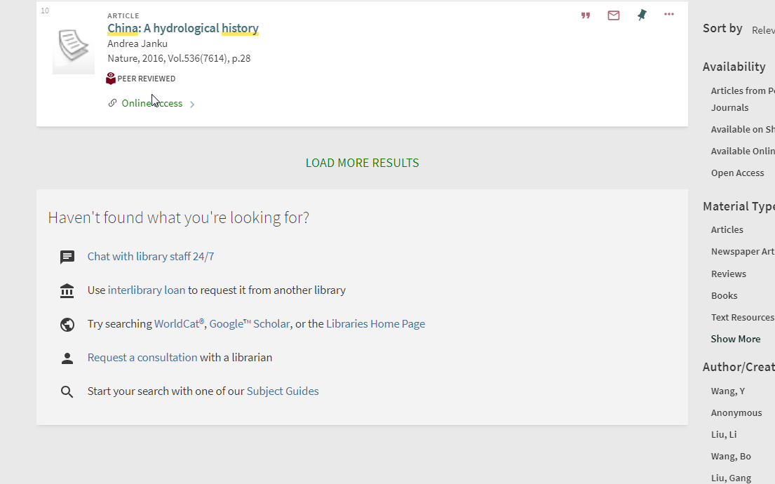
Display 'didn't find what you're looking for panel' at the bottom of search results
Offer options for users to obtain assistance or search offer databases if they are not finding what the sources that they need for their research.
Looks like U Minn Libraries took it out. I like the idea of this, although maybe it would be hidden until the patron has gone through a certain number of pages? (Like 3-5 pages of results) -ZW
Activate autocomplete for search keywords
Make it easier for libraries to activate this feature. Ensure campuses are aware of this functionality.